This is often heard at Arts Together. It’s the way our preschool classes begin. It’s how most of our dance classes start—with passing the energy. Art classes come together around a table to create a project. Drama classes often conclude with affirmations in the form of a circle. Our staff meetings gather the same way – a circle of voices and viewpoints. Everyone is heard and valued. It’s how groups work best because it encourages collaboration, connection and community.
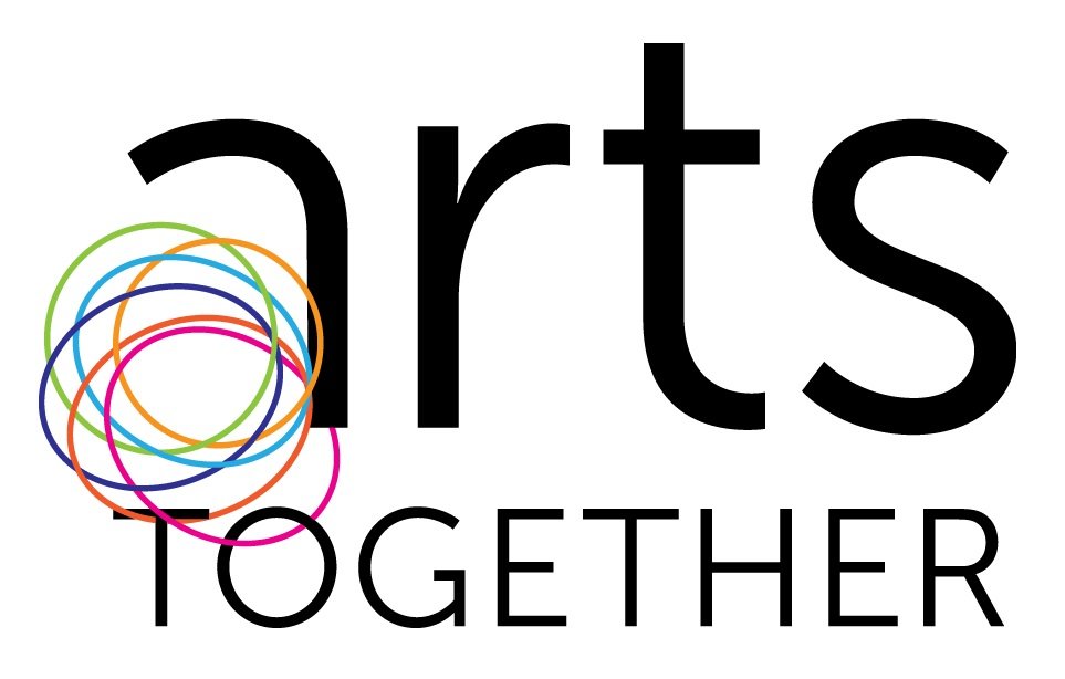
It’s a circle. Not a line with a start and a finish. Not a triangle with a top and a bottom. Not a square with neatly defined edges. The symbol of a circle has “magical value as a protective agent” – it is inclusive and caring. Circular shapes connote movement, as in dance – they are dynamic, creative and active. They symbolize birth, growth, wholeness and the infinite nature of energy. Some of the first marks we make as children are “scribbles,” those rounded forms that signify the beginning of the creative process.

And now, with circles, we are excited to launch Arts Together’s new brand! We involved many circles of people as we created our new brand. We began with a diagnostic survey of many of our constituents: current and former parents, staff, students, board members, community leaders and supporters. A Brand Identity Task Force was appointed that represented this larger group. We are so grateful to everyone who took the time to offer thoughts and feedback. We are fortunate to have been led by an expert strategic design team at Forma.
We learned a lot over the course of this brand development process and much of what we already knew was confirmed. In spite of the very broad offerings (what we offer), Arts Together’s spirit and attitude (how and why we deliver those offerings) remains remarkably consistent and aligned, across all programs, all classes, and all ages. There is a shared understanding among our stakeholders: Arts Together is a magical place. We cultivate creativity and celebrate individuality.
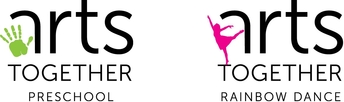
The challenge faced by the Brand Identity Task Force was a difficult one: how can we best communicate our culture and our shared values through a new brand? The result is simple and yet a real symbol of who we are: the main symbol includes connecting circles as the “bowl” of the lower case letter “a.” To give us flexibility, there is also a system of symbols where the “bowl” of the “a” changes depending on the program—a child’s handprint represents our Preschool Division while a silhouette of a dancer represents our Rainbow Dance Company.
This system allows flexibility to promote a single idea, program or division, while visually and consistently connecting all components of Arts Together. This flexibility will also allow new ideas and programs to be introduced in the future. We believe our new look captures the spirit of Arts Together; who we are and who we can be.
By nature a new identity/logo is empty when introduced – and therefore meaningless. It’s basically empty until we begin to fill it with meaning over time. We are already beginning to do that and I’d like to share a story with you: When our designer was looking for an image to embody the Rainbow Dance Company, we turned to recent photographs of our dance company. The image chosen to represent Rainbow was of Carter Crew in a piece for her Senior performance. It just so happens that Carter is our founder Lemma Mackie’s granddaughter. Another generation moves Arts Together forward. Another story is filled with meaning.
Full circle—the connection we all share through this magical place. Thank you for being part of our community at Arts Together!
Meg Revelle, Executive Director